Do you design websites for Czech users? Are you looking for information about their behavior, knowledge and preferences? Then you know how hard it is to find it.
We do user research on a day to day basis, so we thought we could ask users themselves about these things. We got 2964 responses and here are the results…
We found out…
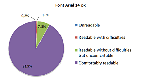
Web typeface size – 14 px is the bestIt has been found that the text type size users rated as the most comfortable to read was 14 pixels (using the Arial typeface). It was selected by nearly 92% of users. Users aged 45+ also felt comfortable with a text type size of 17 pixels. |
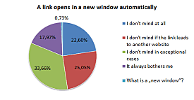
Opening a link in a new window is a problemMost users do not like links opening in new windows; they are able to use the function anyway. More than 80% of users are able to open a link in a new window; more than 75% of users mind links automatically opening in new windows. |
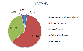
CAPTCHA copying is a problemOver 60% of respondents claim they have experienced problems when copying CAPTCHA. |
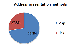
Users prefer embedded mapsMore than 70% of respondents prefer an embedded map to a link to a map portal for showing the location of an address. |
We recommend
- Website design should include password confirmation fields. Users tend to have a positive response to the presence of another field in which they are required to re-type their selected password.
- Present the user with an alternative method of printing the website. Apart from the function that is built into the web browser, offer the print icon directly on the website and consider what the site looks like in word processors (MS Word, etc.).
- Offer the text zoom function on the website and do not take for granted that the user’s browser offers it.
- Maintain the routine of different colours for visited and unvisited website links. Most users perceive different colours of website links as the distinctive feature between visited and unvisited websites.


