Survey Findings
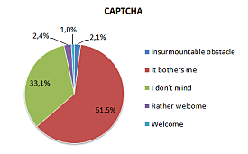
CAPTCHA copying is a problem
Over 60% of respondents claim they have experienced problems when copying CAPTCHA.
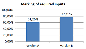
Marking obligatory fields with an asterisk is insufficient
Marking obligatory form fields with bold typeface (Variant A) or an asterisk (Variant B) does not suffice. As expected, only 61% and 77% of users selected the obligatory fields (variants A and B, respectively).
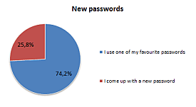
Users use their favourite passwords
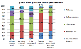
Nearly 75% of users claim they only use several favourite passwords for all their user accounts on the Internet. Any conditions to curb a simple password are obtrusive.
Users do not mind confirming passwords during registration
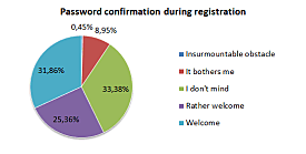
Surprisingly, more than 57% of users hold a positive view on confirming their passwords during registration. 90% of users hold a positive or neutral view. The reason is that users might consider password confirmation as a true check rather than a strain.
Web typeface size – 14 px is the best
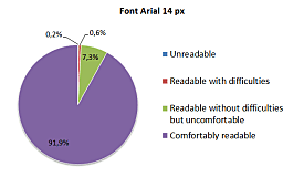
It has been found that the text type size users rated as the most comfortable to read was 14 pixels (using the Arial typeface). It was selected by nearly 92% of users. Users aged 45+ also felt comfortable with a text type size of 17 pixels.
The best-known keyboard shortcuts are “copy” and “paste”
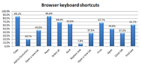
The keyboard shortcuts users knew most often were those for “paste” (85.6% of respondents knew) and “copy” (85.1% knew). Other shortcuts “select all”, “print”, “save”, and “find” scored from 60 to 70%.
Nearly all know the Facebook icon
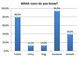
The logotype of the website of the Facebook social network (see below) was known to nearly 95% of users.
Opening a link in a new window is a problem
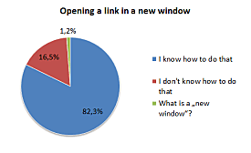
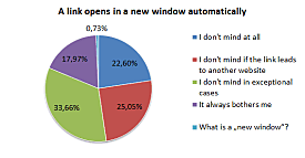
Most users do not like links opening in new windows; they are able to use the function anyway. More than 80% of users are able to open a link in a new window; more than 75% of users mind links automatically opening in new windows.
Two map portals – Seznam and Google
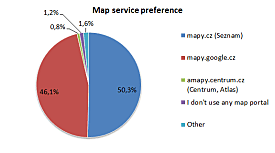
Users predominantly refer to two map portals – Mapy.cz and Mapy.google.cz. Therefore, users show no clear preference for a single map portal.
Users prefer embedded maps
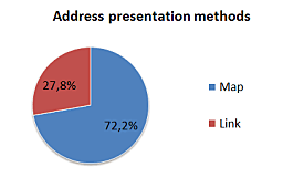
More than 70% of respondents prefer an embedded map to a link to a map portal for showing the location of an address.
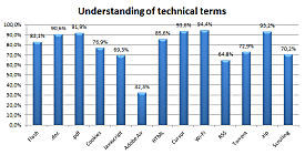
Users know technical terms
More than 24% of all respondents believe they understand all these indicated terms and they could explain them to another person: Flash, .doc, .pdf, cookies, Javascript, Adobe Air, HTML, mouse/cursor, Wi-Fi, RSS, torrent, ZIP, and scrolling. The best-known terms, which over 90% of users understand, are: mouse/cursor, Wi-Fi, .zip, .pdf, .doc.
