
Survey of Czech internet users'
knowledge and behavior, January 2011
Guidelines for Website Creators and Designers
Lists should be shorter
A list, a droplist or listbox web element, should be shorter (i.e. it ought to contain fewer items). To navigate a list, users most often use the scroll bar which is impractical in the case of long lists.
Detailed rationale
Only a minority of users are capable of using keyboard shortcuts (i.e. using letter keys) and other alternative techniques. Therefore, this manner of navigating item lists cannot be relied upon. On the contrary, the group that deserves to be focused on is the group that uses the scroll bar. This tool is nearly useless in situations when the list contains a large number of items – the scroll box is too small and it is difficult to click with the mouse.
The list itself should be shorter so that the user may navigate through the items using the scroll bar only.
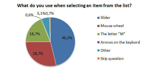
Figure 1: Representation of respondents by method of item selection from the list
Do not use CAPTCHA
Do not use CAPTCHA, prepare a different method of man-machine verification for the user.
- If you still decide use CAPTCHA, apply methods by which the computer fills in the CAPTCHA symbols for the user automatically. You might consider using the JavaScript language, which spam robots cannot recognize
Detailed rationale
62% of respondents claim they experience problems when copying the CAPTCHA symbols. Alternatives are being offered by the W3C Consortium as well (http://www.w3.org/TR/turingtest/).
If, however, you include CAPTCHA in your website design, consider using the JavaScript language, which spam robots cannot recognize. A website using the new, modified CAPTCHA feature with the JavaScript language, does not show CAPTCHA at all in the end. The user’s computer fills the field for the user automatically.

Figure 2: Opinions on copying CAPTCHA symbols
Marking obligatory fields with an asterisk is not enough
Marking obligatory fields with an asterisk is not enough. All obligatory fields in forms which the user must fill in must use complementary highlighting methods, e.g. add a caption to inform the user that the fields marked with an asterisk are obligatory and must be filled in to advance within the form and to process it.
Detailed rationale
Marking obligatory form fields with bold typeface (Variant A) or an asterisk (Variant B) does not suffice. In confirmation of the expectations, the methods were selected by 77% and 61% of users, respectively. An example of fields using better marking methods is shown in Figure 4.
 Figure 3: Marking of obligatory fields by expectation |  Figure 4: Obligatory fields with an asterisk and caption |
Do not require the user to use passwords unless really necessary
Do not require the user to use passwords unless really necessary. Generation of passwords is a strain for the user. Therefore, consider the following:
- Is registration with a password in the current website useless? If it is not, what drives the user to establish an account?
- Use “shared” (or single-entry) login
Detailed rationale
Nearly 75% of users claim they only use several favourite passwords for all their user accounts on the Internet. Therefore, generating new passwords represents a problem for the user, so any registration requiring a password must be truly worthwhile and motivating for the entrant.
A solution offering registration without requiring the user to create yet another password might be “shared” (or single-entry) login (http://www.lupa.cz/clanky/systemy-sdileneho-prihlasovani/). This procedure takes advantage of the fact that the user has already created a third-party account. Therefore, they log in with information they already know and do not need to remember any new login name and/or password.

Figure 5: Password generation method
Website design should include password confirmation fields
Website design should include password confirmation fields. Users tend to have a positive response to the presence of another field in which they are required to re-type their selected password.
Detailed rationale
More than 57% of users hold a positive view on password confirmation. More than 90% of users hold a positive or neutral view on this feature. The reason is that users might consider password confirmation as a true check rather than a strain.
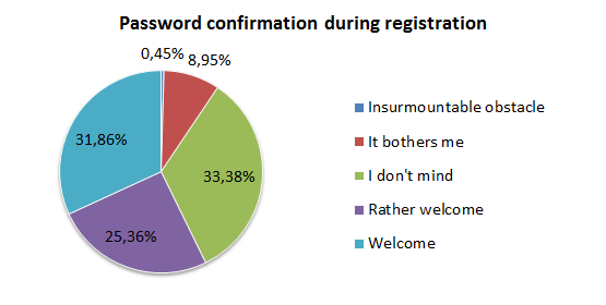
Figure 6: Views on password confirmation during the registration procedure
Maintain the routine of different colours for visited and unvisited website links
Maintain the routine of different colours for visited and unvisited website links. Most users perceive different colours of website links as the distinctive feature between visited and unvisited websites.
Detailed rationale
As expected, nearly 85% of respondents indicated that different colours of the links in the sample website show which sites have or have not been visited.
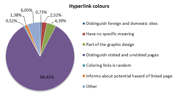
Figure 7: Different colour of website links, representation by opinions
The minimum text type size on a website should be 14 pixels
The minimum text type size on a website should be 14 pixels. Older users have also stated that text type size 17 was suitable. Using type sizes larger than 17 pixels is the starting point of rapidly reduced comfort of reading such text. Also offer the text zoom function on the website; do not take for granted that the user’s browser offers it.
Detailed rationale
The text type size users rated as the most easy to read was 14 pixels (using the Arial typeface). It was selected by nearly 92% of users. Users aged 45+ also felt comfortable with a text type size of 17 pixels. Using type sizes larger than 17 pixels is the starting point of rapidly reduced comfort of reading such text.
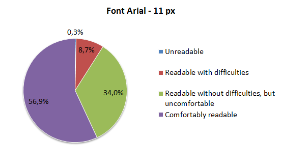
Figure 8: Arial typeface, 14 px, reading comfort
Try and refrain from using links that open new windows
Although most users are able to open a link in a new window, they do not like this function. Design the website so that it contains as few such links as possible. Cases which may be considered worthwhile are mentioned below:
- Help when filling in forms
- When opening the link in the current window could compromise the safety of an action or loss of data (processing a bank transaction, a payment, etc.)
Detailed rationale
More than 80% of users are able to open a link in a new window; more than 75% of users have reasons why they mind links automatically opening new windows. Therefore, it is not necessary to use links that automatically open new windows.
 Figure 9: Ability to open a link in a new window |  Figure 10: Opening a link in a new window, representation by opinions |
Present the user with an alternative method of printing the website
Present the user with an alternative method of printing the website. Apart from the function that is built into the web browser, offer the print icon directly on the website and consider what the site looks like in word processors (MS Word, etc.).
Detailed rationale
Respondent views on printing information from websites are rather varied. As such, it is necessary to modify websites to conform to current user skills and to offer new functions:
- The print icon (or a link to a printable version of the website) should be shown in a distinct location and in sufficient size
- Modify the page design to the environment known from MS Word
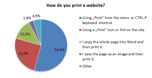
Figure 11: Website printing methods
Use embedded maps
Instead of a link to a map portal, use an embedded map.
Detailed rationale
More than 70% of respondents prefer an embedded map to a link to a map portal for showing the location of an address.
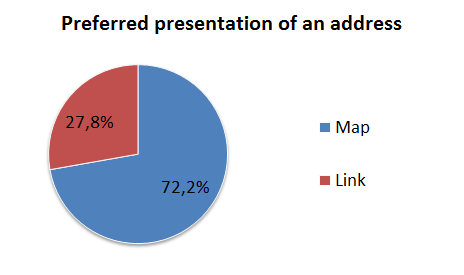
Figure 12: Address presentation methods
Facebook.com or Seznam.cz servers may be used for shared login
Very popular servers, such as Facebook.com or Seznam.cz, may be used for shared login. Facebook uses its own solution of shared login, Seznam.cz uses the international OpenID standard.
Detailed rationale
90.6% of respondents use the Youtube.com web service, Facebook.com is second (76.1%), and Seznam.cz third (68.8%). The high scores of these services indicate a suitable environment for using the shared login. This recommendation closely relates to Guideline 4.
 Figure 13: Usage of web services | 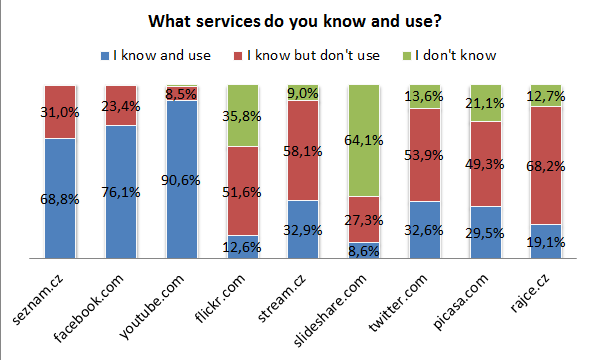 Figure 14: Awareness and usage of web services |
A drop-down menu needn’t be a problem
A drop-down menu needn’t be a problem. You may use it on the website if you comply with the utility basics – the menu must have large rows and columns, and it must not disappear.
Detailed rationale
10% of respondents do not like drop-down navigation menus. Therefore, a well-controlled drop-down navigation menu is a feature users do not mind. However, the statement must consider the specific menu that was used in the Internet User Knowledge and Behaviour Survey. A well-controlled menu must have practical parameters – individual rows and columns of the menu must be large enough, and a specific tolerance must be established so that moving the pointer away from the menu (i.e. beyond its physical and graphic borders) does not cause the menu to disappear.
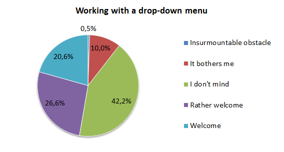
Figure 15: Views on working with the navigation menu